Data Exploration
In this class, you will explore a dataset of your choice using Excel.
Preparation
First, watch the two hour “Data Visualization for Data Analysis and Analytics” course. The course is hosted on LinkedIn Learning, which is available for free to Clark students.
Next, watch the one hour “Excel: Introduction to Charts and Graphs” course. If you’re already an Excel expert, feel free to skim this course.
Finally, install Excel on your computer. Excel is available for free to Clark students as part of Microsoft Office. Bring your computer to class, so you will have it for the in-class activity.
In Class
You can complete this activity either individually or with a partner.
Task 1: Select and Download a Dataset
Choose to analyze one of the datasets listed here: https://vincentarelbundock.github.io/Rdatasets/datasets.html
Click on the “DOC” link to read more about each dataset. Right-click on the “CSV” link to download the data itself.
Note: I’ve used the “Do Workplace Smoking Bans Reduce Smoking?” dataset in the examples below, so please choose a different dataset.
Task 2: Open the Data in Excel
The file you downloaded contains the dataset in a “comma-separated values” (CSV) format. This is the most common format for sharing datasets, since it is easy for programs to read. CSV files are easy to recognize, since they have the .csv file extension.
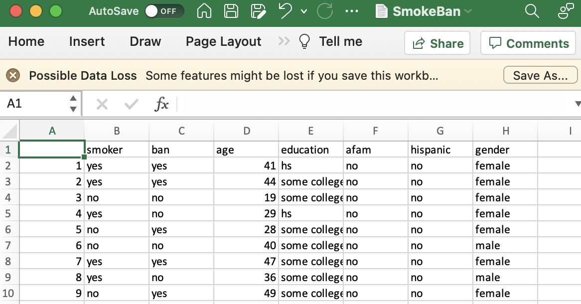
Next, you will open this file in Excel, either by dragging the file into Excel, or using the “Open” option in Excel. After opening the data, you should see something like this:
You will submit at least three charts and at least three summary statistics based on your data. You can choose which statistics and charts to generate for your data. In the subsequent tasks, I give examples from my dataset.
Note: Open a CSV file in a plain-text editor (e.g., Notepad on Windows, or TextEdit on macOS), and you will see how this format got its name.
Task 3: Exploratory Data Analysis
The first thing scientists do when analyzing a dataset is perform an exploratory data analysis. Typically, scientists calculate summary statistics like counts, averages, medians, etc., and generate some simple charts. The goal is to confirm that the data was imported properly, and to get an overview of the data.
Average Age
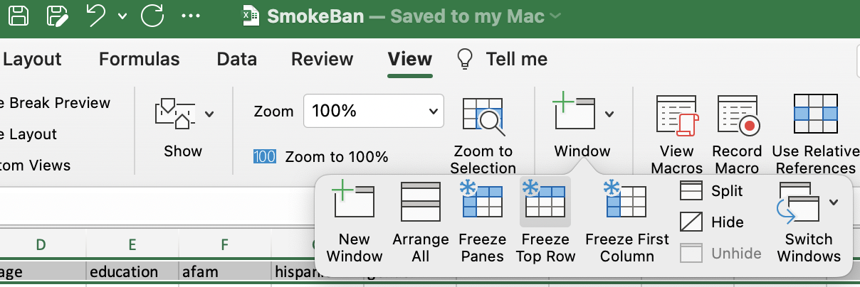
My dataset has 10,000 rows, and I like to calculate summary statistics at the bottom of the data. The first thing I’ll do is freeze the header row, so I can see it after I scroll down:
After scrolling down, I click on the cell under the age data, then type: =AVERAGE(D2:D10001). This tells Excel to apply the AVERAGE function to the specified cells. Each cell is specified by its column letter and row number.
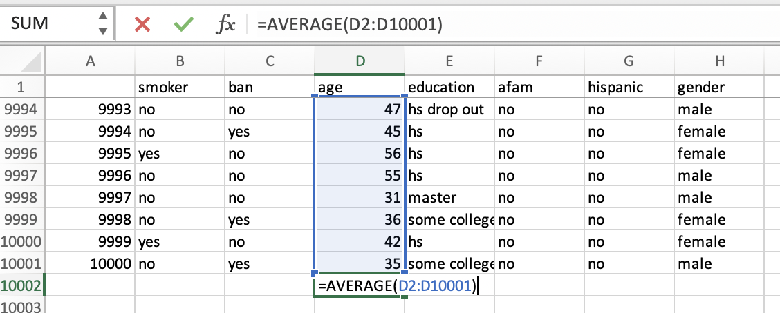
After pressing enter, I get the result: the average age of people in this dataset is 38.7 years old.
Pie Chart
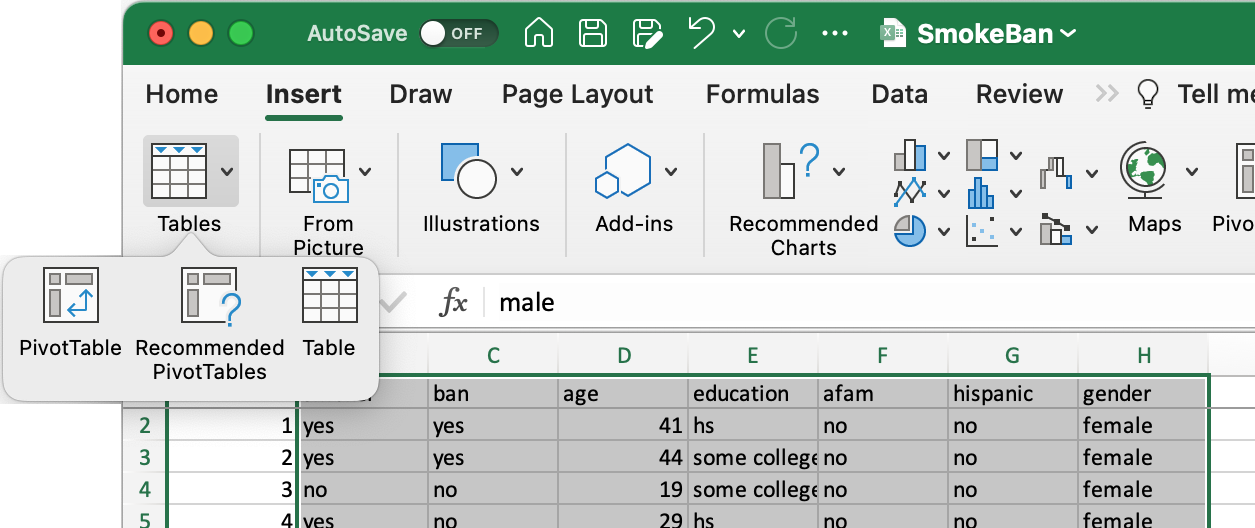
Next, I want to understand how many people smoke. This is easy to do using Excel’s “PivotTables” feature. First, select all the data. If you added summary statistics to the bottom of the data, be careful not to include these statistics in your selection. Then, choose “Insert”, “Tables”, “PivotTable.”
A dialogue box will open. Leave all the options as defaults, click “OK,” and a new worksheet (AKA, a tab) containing the PivotTable will be created. Check the column of interest (e.g. “smoker”), then drag it to the “Rows” area. You should see something like this:
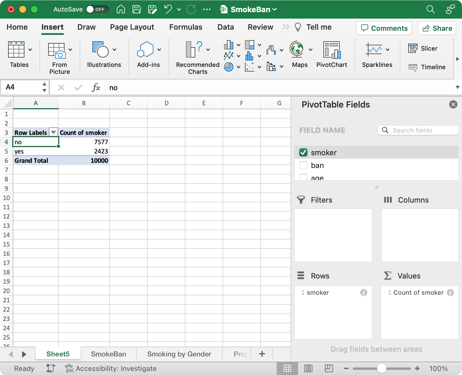
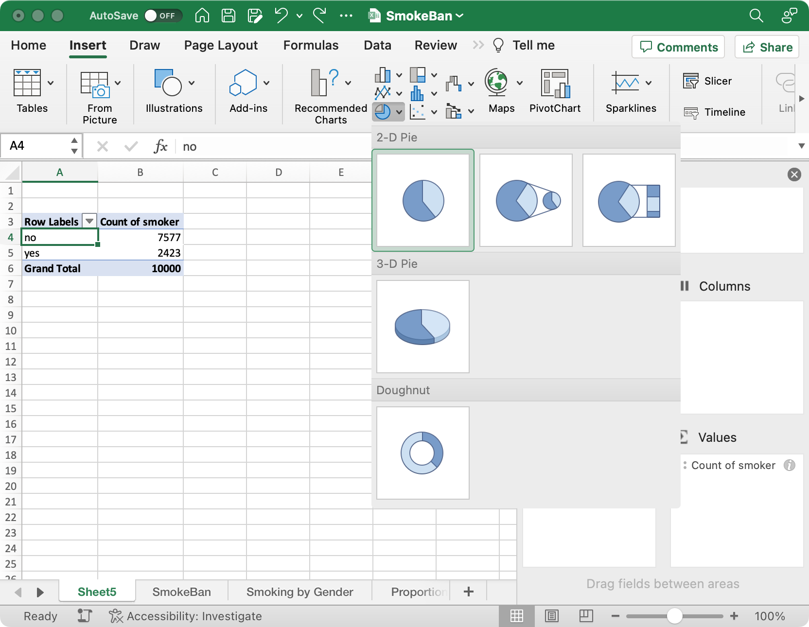
As you can see, the PivotTable counts the number of times each value appears in the column of interest. This summary data will make it easy to create a pie chart. Next, select the pie chart from the “Insert” ribbon.
The pie chart shows that about 1/4 of people were smokers.

Finally, you should give the pie chart an informative title (e.g., “Proportion of Smokers: Nearly 1/4 of Workers Smoke”).

Note: Pie charts work well for variables with a few different categories (e.g., smoker or non-smoker). If a variable is numerical (e.g., age) a histogram is more appropriate.
Task 4: Relationships Between Variables
After completing an exploratory data analysis, the next step is to look for relationships between different variables. For example, I could analyze whether people who worked at a company with a smoking ban were less likely to smoke. This can be done with a multi-field PivotTable, which is referred to as a contingency table. For example, this analysis shows that workplaces than ban smoking have fewer smokers:
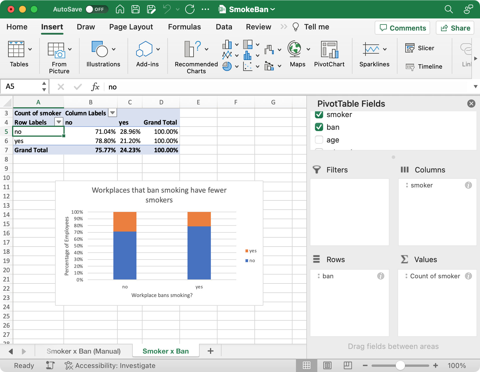
To create a contingency table:
- Activate multiple fields in the pivot table.
- Make one field a column and one field a row.
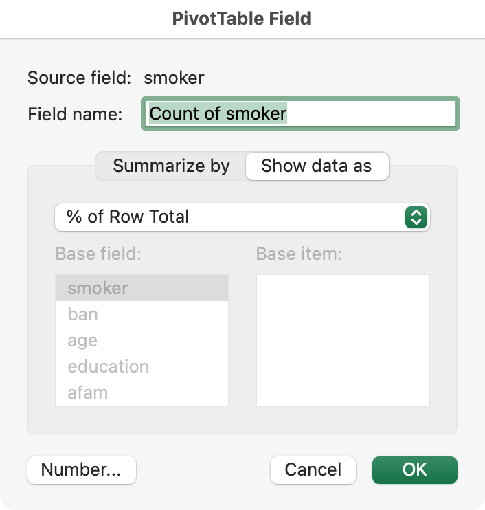
- Edit the “Count” to display as “% of Row Total:”
Then, visualize the data with the appropriate chart.
Note: Without performing a statistical hypothesis test, it is unclear whether the relationship in my data occurred by random chance. Furthermore, although my analysis suggests that workplaces which ban smoking have fewer smokers, this doesn’t establish a causal relationship. One possible explanation is that smoking bans encourage workers to quit smoking. Another possibility is that smokers move to workplaces that allow smoking. Other explanations are also possible. Although my dataset cannot prove it, other research shows that smoking bans do reduce smoking.
Task 5: Share Your Results
Prepare a single PowerPoint slide explaining your most interesting finding, ideally examining the relationship between two variables. Display this slide on a lab computer, as if it were a poster. On this slide, you should:
- Name and briefly describe the dataset you used
- Describe your most interesting finding
- Illustrate your finding using at least one chart, with an appropriate title and labels
Avoid writing too much on your slide, but ensure your slide has enough information to be understood by those unfamiliar with your dataset.
Finish your slide before the last 10 minutes of class. In the last 10 minutes of class, walk around the room and look at your classmates’ slides.
Submit
Upload a one to two page PDF containing:
- Your name(s)
- The results of your data analysis. You should include:
- The name of the dataset you analyzed
- A short paragraph describing your dataset
- A short paragraph explaining what you learned from your analysis
- At least three charts, at least one of which should show the relationship between two variables
- At least three summary statistics (e.g., average, minimum, maximum, etc.)
- Thoughts on how this activity could be improved in the future
Focus on clearly communicating your findings: use appropriate charts, label your charts, etc.
Learning Goals
Students will:
- Practice calculating statistics and visualizing data
- Gain awareness of public datasets